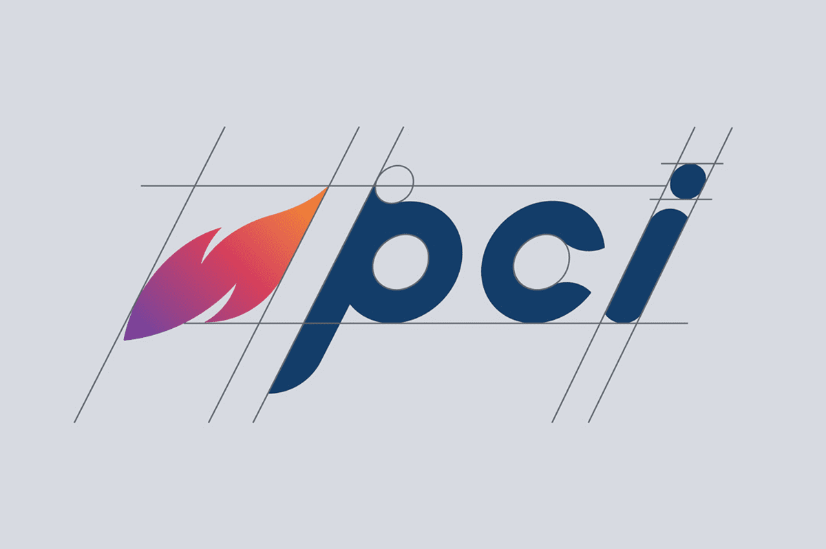
We started with a logo redesign that better aligned with who they were becoming as a company while giving a nod to their traditional values. We gave the flame symbol, which was only subtly visible in their previous logo, a serious upgrade with a modern and energetic twist. To properly convey PCI’s adept ability to adapt to the evolving needs of their customers, we created the feel of forward motion through our typography choices.


PCI
The Client
PCI
The Challenge
Marking a decade of growth and transformation, PCI needed a brand and website that reflected the momentum of their evolution.
We partnered with PCI to redefine their identity, beginning with a new name that better represented the breadth of services they offered and moved them beyond the limitations of their former title. The goal was to create a modern, confident presence that matched their energy and positioned them clearly for the future.
Awards
• Gold MarCom Award, Strategic Communications, Brand Refresh
• Silver Communicator Award, Corporate Identity, Logo
The Services
• Logo Design
• Visual Identity
• Brand Collateral
• Web Design
• Social Media Design
BRANDING REFRESH
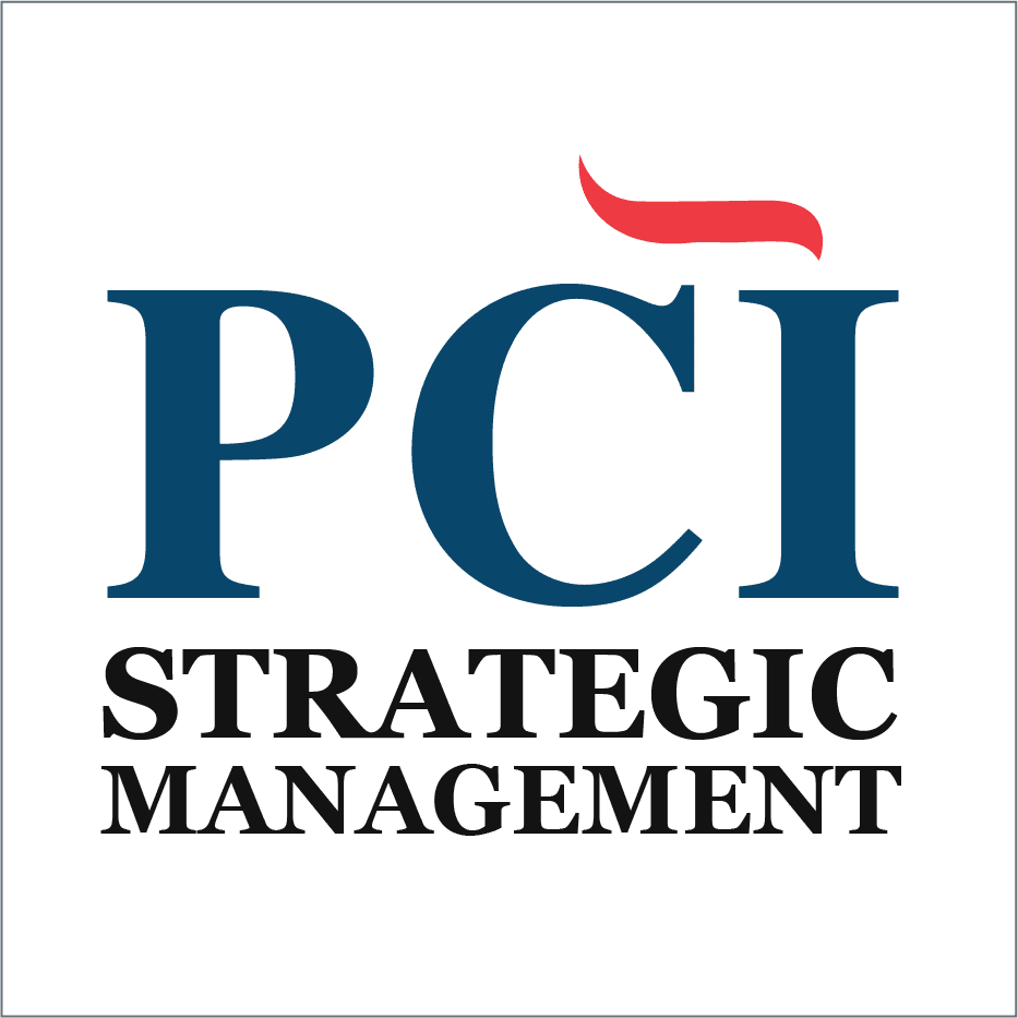
Old Logo
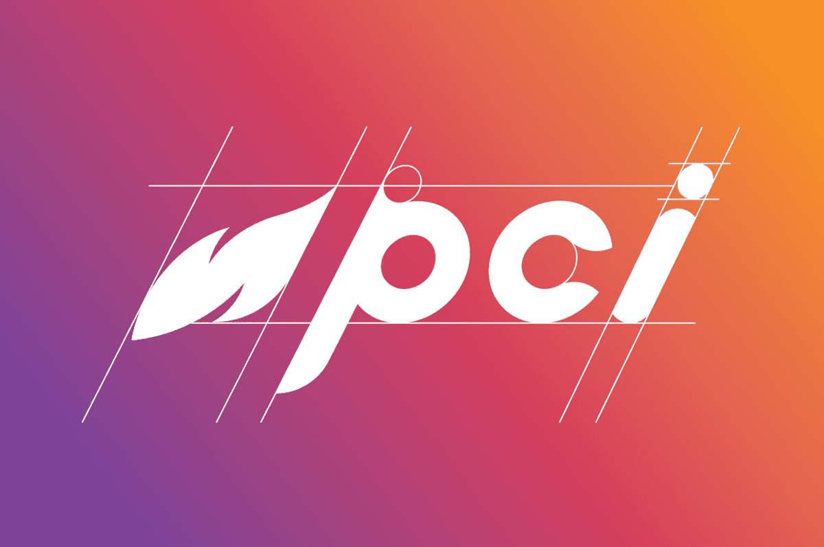

#734995

#C74B5E

#E69443

Gradient

#1E3D66
OUR PROCESS
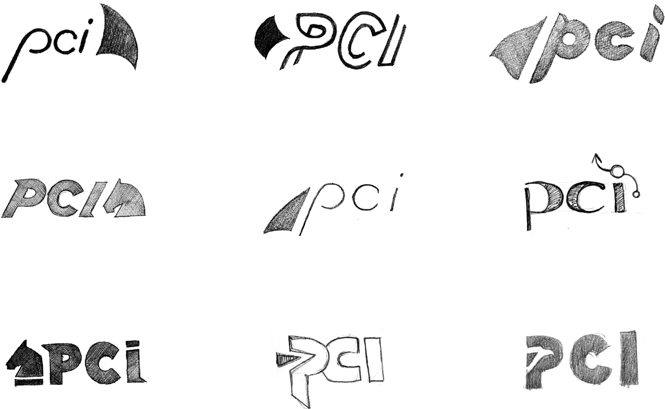
Our logo design process begins with a pad and paper. Beginning this way allows us to ideate, collaborate, and fail fast so that we can quickly narrow down our concepts to the best solutions.
WEBSITE TRANSFORMATION
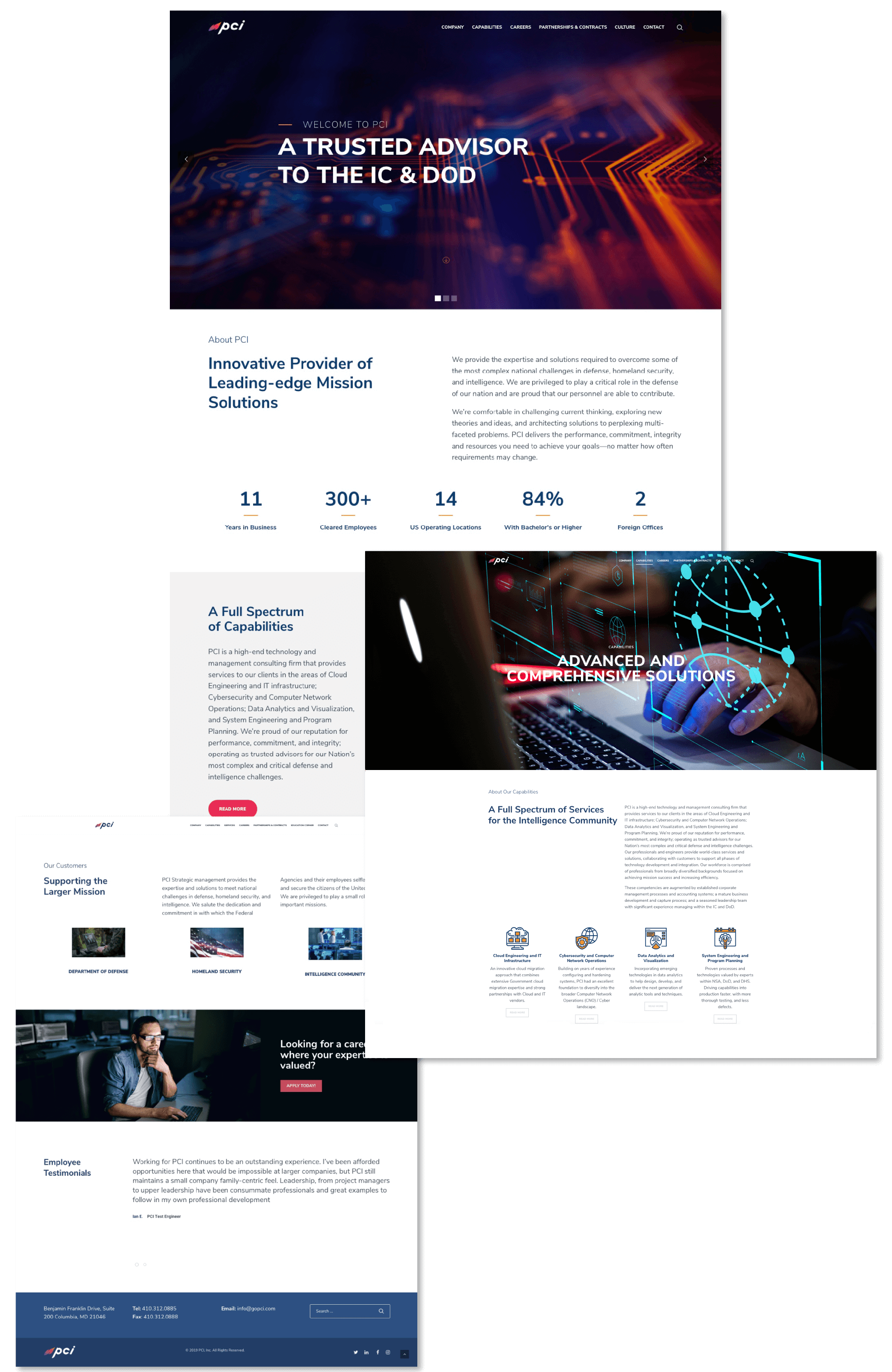
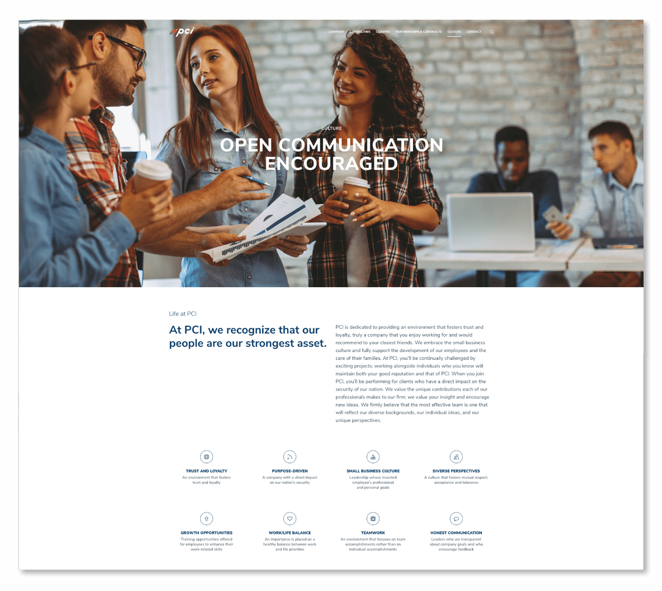
After tackling PCI’s bold new logo, 11p went to work on overhauling their entire website. The revamped site not only matches the spirit of PCI’s modern and progressive brand but also highlights their capabilities and company culture in a clear, direct, and exciting design, guaranteeing a positive user experience.

Cloud Engineering
and Enterprise IT

Data Analytics
and Visualization

Cybersecurity
and Wireless

Systems Engineering
and Strategy
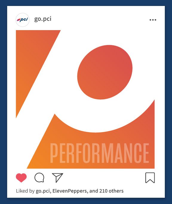
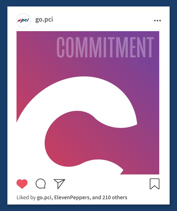
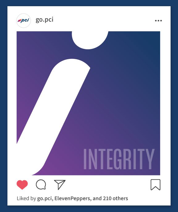
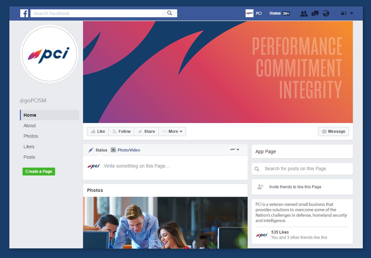
BRANDED SOCIAL MEDIA
Related Projects