Mastering the Art of Logos: Towson University
For the first time in over 20 years, Towson University is completely overhauling their visual identity, and as a former Towson Tiger, I would like to say, “It’s about time!”
The original logo (pictured right) was created in the 90s, and it certainly feels that way – most notably, in the typeface. The font, Trajan, was released in 1989 as one of the first Adobe fonts that was made widely accessible to the everyday user. Everyone was jumping on the Trajan train (look at most movie posters around that time, example: Titanic). Unfortunately, over time, Trajan became so overused that the Towson mark, even with the edited serifs, lost a lot of its strength and any uniqueness.
In addition, the old logo never held a candle to the much-beloved Towson Tiger athletics mark. Most of the university store apparel donned that tiger mark, because I’m sure, they noticed in their sales that everyone preferred it to the actual university logo. Ouch. When used in the same space, the athletics logo would completely dwarf the university logo – bad news when you’re trying to promote other programs.


In 2015, when TU was turning 150 years old, they saw an opportunity to rebrand – and came up with this (pictured right). However, it didn’t fix any of the problems inherent in the previous logo, i.e. same weak typeface. While the bold color block is nice, I’m not a fan of the addition of the Stephens Hall clock tower. It makes the logo feel so much older and more “ivy league” and thus, less approachable. In my mind, Towson was an alternative to stuffy (my opinion) colleges with gigantic price tags, so it didn’t fit.
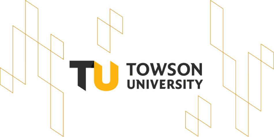
The logo was in need of a much-deserved revamp, and thankfully, that’s what Towson decided to do this time. While the full rebrand hasn’t been released yet, Towson unveiled their new university logo to the public on January 1st.
They claim that the Maryland flag inspired the new logo design. I think this was a good move – clearly, the flag is an important point of pride for Marylanders. Drawing on that existing sentimental attachment is a great way to forge a new emotional connection with the logo. The inspiration is made apparent in the “TU” through the chiseled serifs and the mimicking of the black-and-gold Calvert quarters of the Maryland flag. It’s a subtle way to say “Maryland” without being, “The University of Maryland.”
The folded shadow in the “TU” is interesting, but I’m very curious to see how it’ll be addressed in a single-color version of this mark (not released as of today), which would be used in truly single-color applications like engraving.


Written by
Kate Rodman
Designer at 11P, Illustrator, Animal Lover, Fuzzy Blanket Connoisseur.