Designing Away From The Screen
With the age of technology, we are able to do so much more and reach so many more people in literally seconds. But does all of that time in front of a screen start to have a negative impact on our creativity and thoughtfulness? Can moving away from our screens change and improve our designs?
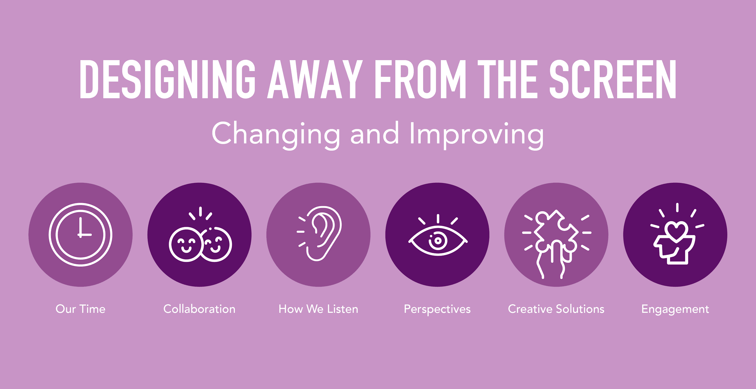
Can adapting to a screen-less approach have a positive impact on:
- Our Time
- Collaboration
- How We Listen
- Perspectives
- Creative Solutions
- Engagement
People computers = the key to designing interfaces
Yes, most of us are designing for screens, but our users are not spending most of their day interacting with screens. They are interacting with real world objects and people, so shouldn’t we be doing the same while designing those interfaces?
Challenge your design process or your team to try new ways to problem solve and discover. We don’t need our fancy programs to design, we just need brain power and a problem. So let’s stop clicking and start thinking!
Getting away from the screen – what to do instead:
RESEARCH AND DISCOVERY
Product Audit – Take the time to discover everything about the current tool/new project from speaking with the stakeholders.
Kick-off Meetings – Get everyone in a room for a whole day – or more! This is a useful strategy for business, development, content, and design.
Competitive Analysis – Go to real locations of similar and non-related businesses and ask all the questions you would normally discover from website competitive analysis.
User Interviews/Research – Use IDEO Methods (IDEO Method Cards are tools that we can use as designers to research our users, products, and potential projects). Talk to real people.
Personas – Team scrapbooking for real people you’ve met in your research. Pull faces from magazines or other papers.
DETERMINING SCOPE AND PRIORITY
Include all team members in the planning effort (yes Devs, you too)!
User Journeys/Scenarios – Get everyone’s perspective to create User Journey Stories on a white board. Make it a team discussion!
Requirements Document – Make more than a designer’s checklist…. Get everyone’s perspective on what will happen and when. Your requirements start to form your product’s culture. Who/What > Action > When.
Prioritization and Timeline – Don’t start by using a fancy online system like Monday or Jira. Ask everyone for input on prioritizing tasks from the Requirement Documentation.
STRUCTURING YOUR PROJECT
Conceptual Models – Go to the same places your users go when interacting with like-products or in similar environments like the one you’re creating. Are there any common concepts the users may be used to, like a shopping cart? Can and should these be relayed to the screen?
Information Architecture – Get out the cards! Time for some classic IDEO card-sorting. There are so many amazing hands-on ways to discover a hierarchy that makes sense for your content.
Error Handling – Pick up the phone OR go offsite to better understand how businesses and people handle errors in the real world.
Structuring and Language – Time to make another stop! Head out to where your users would interact with the content of your product. Finding any familiar/unfamiliar language? What kind of process do user’s go through when coming to these locations?
User Flows – Break out the sticky notes! Create a tangible, yet visual way to organize all of your content, pages, and features. Get the team in on this one!
DRAFTS, SKETCHES, AND WIREFRAMES
Navigation Design/Wayfinding – Go to locations that typically have strong direction-based environments. Think of places like IKEA, a popular trail, malls, etc. Note the way yourself and users navigate through and around the location.
Brainstorming Session – The more brains, the merrier! Don’t slump back into your cubicle quite yet. Share all your findings and hear what your team has to say! You might be surprised by what you’ve missed along the way.
Thumbnail Sketches – Sharpen those pencils and get to drawing. Don’t be precise! You should spend 30 seconds to a minute on each sketch. Include the whole team on this one! You’re not the only one who can make boxes and arrows.
Wireframes – Sketch, Illustrator, and XD, OH NO! Grab your graph paper and pencil to cleaner lines and more accurate positioning. This is a time for some epic iteration. Share with your team, try and grab some real users. Just keep drawing!
CREATING THE FINAL LOOK
Use All 5 Senses – Use all of your senses! Everyone knows what Christmas smells like and everyone can picture the feeling of crunching down on a leaf in the fall. How can you take advantage of all of your user’s senses to create a well-rounded brand?
Mood Board – Go hunting for inspiration, no not on the internet. Find actual objects to represent your brand’s look and feel. Go into it with some key words and ask your team if you hit the mark.
Typography – Don’t just pair fonts… Take images of existing fonts from real life. Compare them to our mood board of senses! Do they fit in? What type of fonts match the best?
Style Guide and Mockups – Bring in the Developers and determine all of the elements you need based on your wireframes. Bring print outs of your wireframes and have coloring sessions with your brand colors to determine final look.